Europe unites behind first continent-wide seagrass restoration recommendations
Alliance of scientists from 17 countries calls on policymakers to protect and restore one of Europe’s most vital marine ecosystems
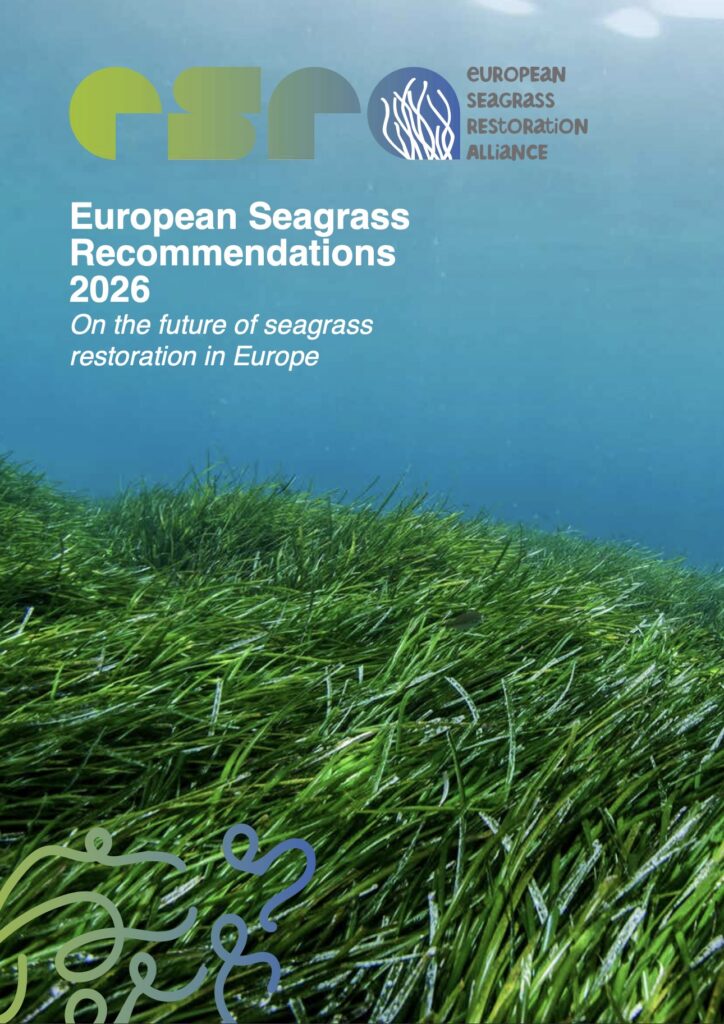
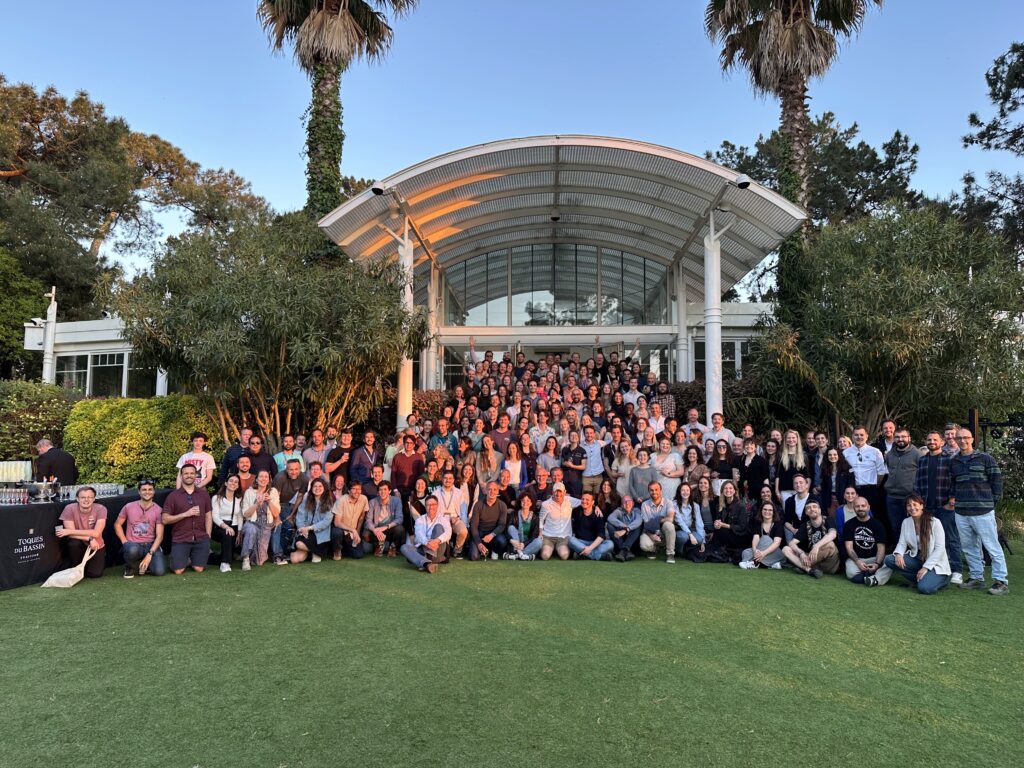
The European Seagrass Restoration Alliance (ESRA) today publishes the European Seagrass Recommendations 2026 – the first continent-wide scientific consensus on how to protect, monitor, and restore seagrass meadows across Europe. The document, co-created by more than 50 scientists from 17 European countries, sets out eight concrete recommendations to guide policymakers, managers, and funders in reversing decades of seagrass loss.
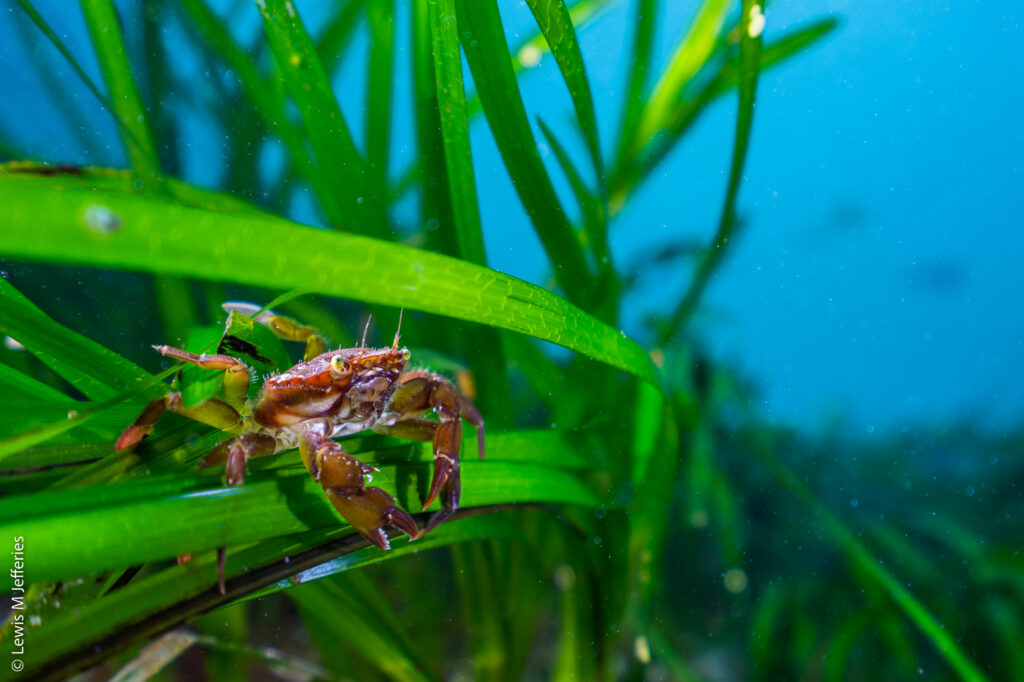
Seagrass meadows are among the most productive ecosystems on Earth. They support coastal fisheries, protect shorelines from erosion and flooding, filter water, and store significant quantities of carbon. Yet across Europe, these habitats have declined dramatically – lost to poor water quality, coastal development, disease, invasive species, and unsustainable use. Despite their immense ecological and societal value, seagrass meadows remain poorly protected and underfunded.
“We now have the science, the tools, and the momentum to turn the tide” said Prof. Dr. Laura Govers of University of Groningen in the Netherlands. “But success requires political will, sustained investment, and governance frameworks that actually enable restoration rather than obstruct it. These recommendations provide a clear, evidence-based roadmap for that action.”
The timely publication of the European Seagrass Recommendations will contribute to facilitating the implementation of the EU Nature Restoration Regulation but are also equally applicable to non-member states. The recommendations cover the full restoration continuum – from safeguarding existing meadows and reducing human pressures, to large-scale active planting, long-term monitoring, and the development of sustainable donor material supply chains. They call for stronger alignment between European environmental policy and restoration practice, streamlined permitting, and substantial increases in long-term funding. The document also emphasises the importance of community involvement, ethical standards, and open data sharing.
“Alone we can do so little, together we can do so much” said Dr Richard Lilley, Cofounder of French NGO The Ocean Gardners and Chair of the European Seagrass Restoration Alliance. “By fostering interdisciplinary, value-based collaborations, ESRA is helping to establish a shared language between science and policy. These recommendations reinforce the growing awareness and capacity of actors to restore seagrass meadows both effectively and responsibly”
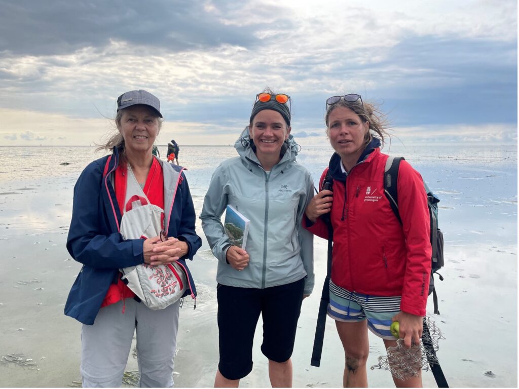
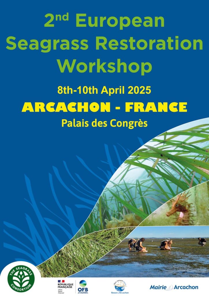
The recommendations were developed following the 2nd European Seagrass Restoration Workshop in April 2025, which was hosted by the French Office for Biodiversity at le Parc naturel marin du Bassin d’Arcachon, France, and finalised at a dedicated drafting workshop hosted by the University of Groningen on Schiermonnikoog, the Netherlands, in February 2026. The recommendations align with the EU Nature Restoration Regulation, the UN Decade on Ecosystem Restoration, and the Kunming-Montreal Global Biodiversity Framework.